Showing posts with label Template. Show all posts

Monday, October 24, 2011

Application Lifecycle Management in Visual Studio 11

This post discusses about new Application Lifecycle Management features in Visual Studio 11. Application Lifecycle Management represents how do you prioritize your requirement, how do you breakdown them into tasks and how do you implement those tasks.

image 

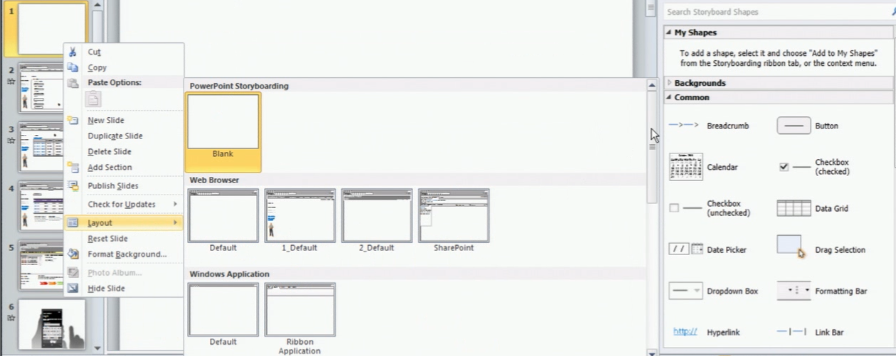
Start with the Requirements, Visual Studio 11 coming up with new tool PowerPoint Storyboarding which you can use for visualise your customer requirements without writing a single line of code.


image

You will be presenting with different templates and layouts to author  the requirements

image

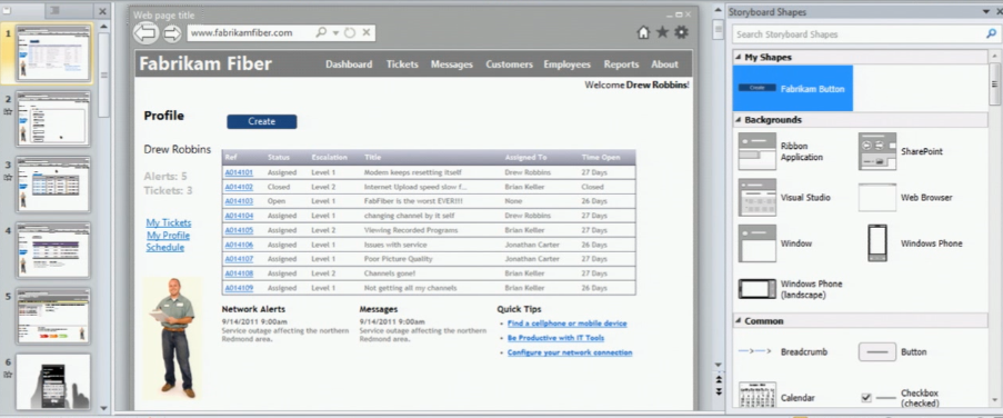
You  can also add various visual elements like button, grid etc to your slide and can add animation to tell your developers what you want to see when click some button in your screen.

image

You can quickly build the mockups using this new tab storyboarding in PowerPoint. Now we got the requirements and need to put in project management to describe what priority you are giving to these requirements and how do you deal with them?

We can do this project management using Visual Studio Team Foundation Server. Visual Studio 11 Team Web Access enhances the developer experience with some new features.

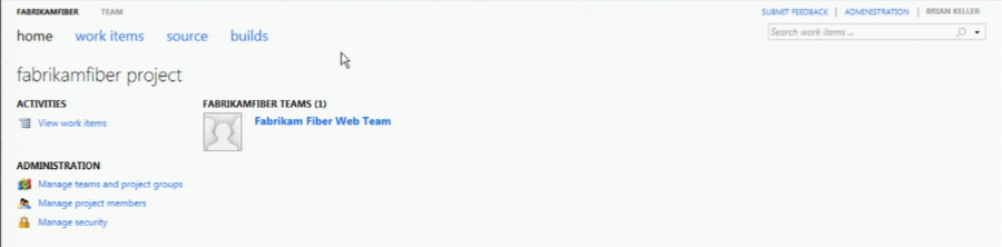
The new Team Web Access looks as below

image

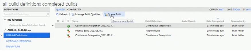
Build Reports using Queue build is a new feature in 11 version

image

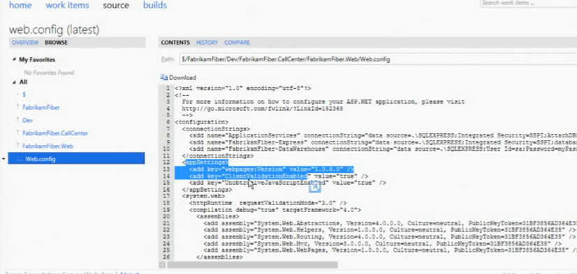
You can make changes to your files under source control using Team Web Access

image

This feature is not go developers to go and use team web access use for check in and check out the files. You can use this to edit the configuration files quickly if there is any change and build the reports quickly.

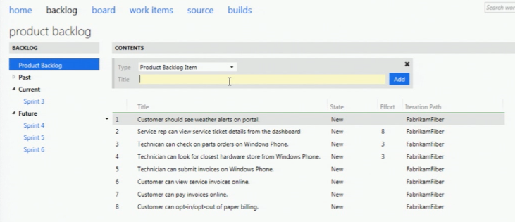
Now you can create teams and their identity and can assign the product backlog for the team using Team Web Access

image

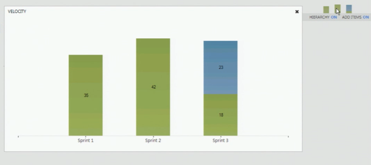
You can prioritize the work-items by just drag and drop these items in team web access. Now you have the velocity charts which represents the story points assigned to the tasks to your team members.

image

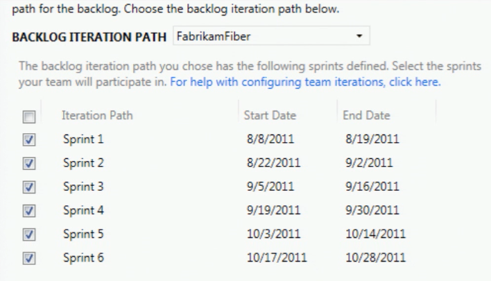
Now TFS web access having the dates for your iterations

image

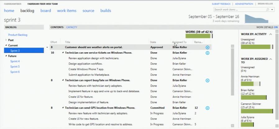
The Sprint screen in Team Web Access looks as below

image

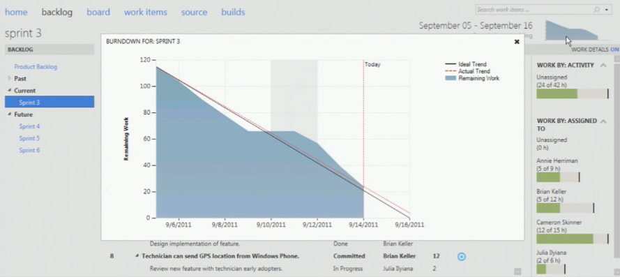
sprint is where you break your product backlog items and assign a time-period and resources to it. You also got the burndown chart in this version which updates real-time with your work-items. Earlier it took time to update till you complete the TFS reports generation.

image

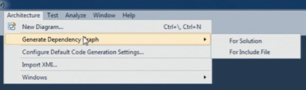
Generating Dependency graph is easy using architecture menu where you can find the dependency between assemblies in your solution. This feature is also available in Visual Studio 2010.

image

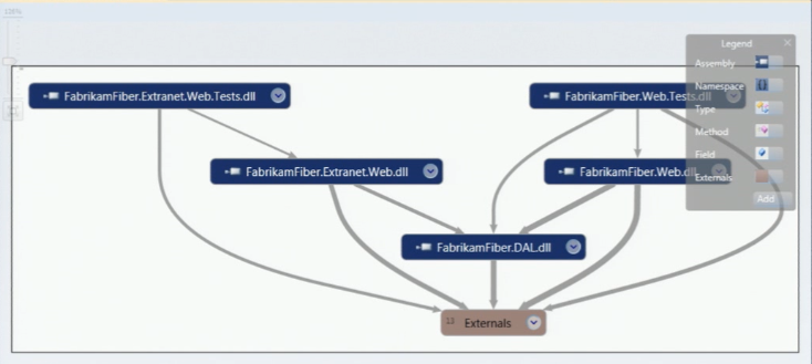
It then generates the graph as shown below

image

In Visual Studio 2010 if your solution is big one then you may need lot of memory to generate these graphs every-time when you choose this option where as in 11 these results are stored in cache and generates the results quickly from cache. It shows the links down to the method level in your solution.

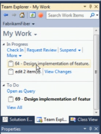
The new team explorer looks new with some new features

image

The suspend link allows you to save all your current work including breakpoints and multiple monitor screens(window positions) if some one asks you to drop off what you are doing now and do a new high-priority work.

You can now search for new work-items within your team explorer. Now it clearly shows what you are doing and what are the incoming requests from other team-members like code-review request etc.

image

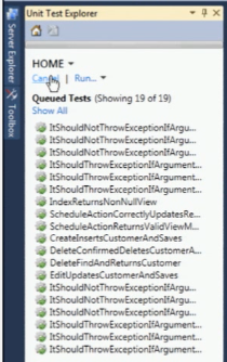
In Visual Studio 11 it supports unit test cases that you have written in Nunit, Xunit and MS-Test. All your test cases now appear in Unit Explorer.

image

There is a new tool in Visual Studio 11 which Analyses your code and finds the similar clones in the solution

image

Analyze Solution for Code Clones identifies the blocks of code that are identical and differ in few lines. This tool is a good candidate for refactoring your code.You can also find code clones from individual files.

image

Select the piece of code which you want to find the clone and say find matching clones in solution.

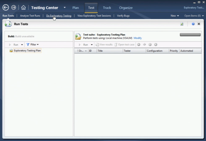
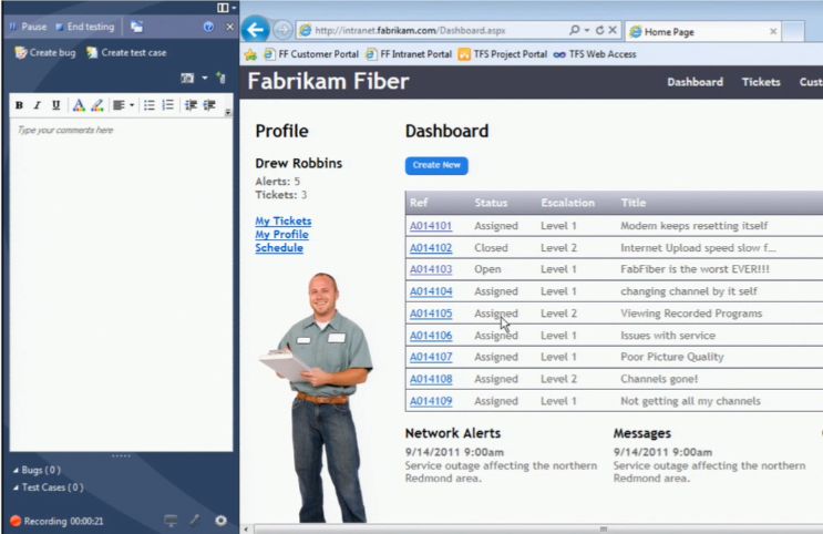
Exploratory testing is something new feature in Visual Studio 11 where you can fire-up your application take the screen shot and save as test case.

image

It records every action when explore this test and create a bug

image

Reference: Cameron session from BUILD.

Monday, August 8, 2011

The future of CSS layouts


For all the wonderful features it provides, CSS does a surprisingly poor job of the fundamentals of page layout. But options for richer, more dynamic pages are on their way, as Peter Gasston explains

After years of promise, CSS3 has finally arrived in style (if you'll pardon the pun). It's added a whole new array of tools to our front-end toolbox, giving us rounded corners, gradients, opacity, transformations, transitions, animations and much more. But now that we have the fun stuff, the eye candy, what's next?
The next problem for CSS3 to address will be layouts. Until now we've got by with floats, relative positioning and negative margin tricks, but we still have to work incredibly hard to produce anything beyond the fairly standard two- to three-column layouts.
The W3C and the browser makers are aware of this problem, and working on a range of solutions. Chief among them (you may be surprised to learn) is the Internet Explorer team. IE10 looks set to herald an exciting new era of CSS layouts, making possible rich, dynamic and eye-catching websites that were previously beyond our reach.
In this article I'm going to take a look at the various layout methods that are at different stages of development, from the well-implemented to the purely theoretical. Perhaps not all of these will make it to the stage where we're able to use them (or, at least, not in their current form), but it's worth taking a look to see where the future lies. If you want more detail about some of the methods in this article, as well as much more of what CSS3 offers, I humbly recommend my book, The Book of CSS3.

Columns


Distributing content over multiple columns is a staple of print, and the CSS Multi-Columns module brings the same flexibility to the web. There are two approaches to making columns, both of which use a different property (applied to the parent element). The first is prescriptive, where you explicitly set a number of columns to flow the text into. The following code creates three columns of equal width, filling the width of the parent:

  1. div { column-count: 3; }

The second system is dynamic, where the width of the columns is fixed and columns of this width will be repeated until they match the width of the parent. In this example I'll set the columns' width to 140px, so in a parent element 800px wide there should be five columns created:

  1. div { column-width: 140px; }
By default there is a 1em gap between each column, but you can change this by using thecolumn-gap property, which takes a length value. You can also put lines between the columns with column-rule, which has the same syntax as the border properties. This code will generate a dotted divider 2px wide, and set the gap to 28px – this will be divided equally on either side of the rule:
  1. div {
  2. column-gap: 28px;
  3. column-rule: 2px dotted #ccc;
  4. }
If you want to see the result, take a look at this example of CSS Columns. You'll need to be using Firefox, Chrome, Safari, Opera  11.1, or IE10 Platform Preview ('IE10PP') to view it; if you don't have one of those, see the image below for reference.
CSS Columns provides an easy way to distribute long blocks of content into a more compact horizontal space
There's more you can do with columns, but space forbids. If you want to see a practical example of their use, take a look at the References section of a Wikipedia article, which usescolumn-count to divide the notes into three columns. Multi-column is implemented in Firefox with the -moz- prefix (and some oddities), Chrome and Safari with the -webkit- prefix, and Opera 11.1+ and IE10PP, unprefixed.

Flexible box

The Flexible Box Layout module ('FlexBox') provides a method of automatically resizing elements within their parent without having to calculate height and width values. As a simple example, imagine you have two child elements and you want them to fill their parent (which has a variable width) in such a way that both have the same width. You could do this with percentages, but it gets complicated when borders, padding and margins are involved. The FlexBox solution is much simpler:
  1. .parent { display: box; }
  2. .child-one, .child-two { box-flex: 1; }
That simply places the two child elements horizontally within their parent, and makes each the same width. The box-flex value actually acts as a ratio, taking empty space and redistributing it between child elements in the proportion of that value; to illustrate what I mean, take a look at this code:
  1. .child-one { box-flex: 1; }
  2. .child-two { box-flex: 2; }
When the two elements are being distributed within their parent, .child-two's width would be increased by two pixels for every one of .child-one's; so if their parent was 260px wide and each child was 100px wide, the remaining 60px would be distributed 40px to .child-two, 20px to .child-one.
This is an easier concept to show than to explain, so you can see it more clearly in this example of CSS FlexBox (you'll need Firefox, Chrome, Safari, or IE10PP). Try resizing the browser window to see it scale.
As well as dynamically changing an element's size, FlexBox can also apply properties to a parent that control where any empty space is distributed, setting the position of its children. The box-align property acts on a child element's width (by default, although that can be changed), and there's a companion property, box-pack, that acts on its height. Here's how it works:
  1. .parent {
  2. box-align: center;
  3. box-pack: center;
  4. display: box;
  5. height: 200px; width: 100px;
  6. }
  7. .child {
  8. box-flex: 0;
  9. height: 100px; width: 100px;
  10. }
The .child element has a box-flex value of 0 so it won't be dynamically resized, and it's half the height and width of its parent. The parent has the value 'center' for its box-align andbox-pack properties, so the child will be positioned in the centre both horizontally and vertically.
We showed how to make layouts with FlexBox in more detail in a previous article
You can read more about FlexBox in the .net magazine article The CSS3 Flexible Box model explained. It's currently implemented in Firefox, Chrome, Safari and IE10PP, with the relevant browser prefixes (-moz-,-webkit-, and -ms-), and there's a JS Polyfill, Flexie, you can experiment with. Be aware that the syntax is changing; details are in the latest draft of the specification.

Grid

Brand new to IE10PP is the Grid Layout system, which I'm quite excited about. The first step to using it is to define your grid with rows and columns. You can use length values, the autokeyword, and a new length unit, fr, which is shorthand for 'fraction'. Take a look at this code example:
  1. div {
  2. display: grid;
  3. grid-columns: 1fr 3fr 1fr;
  4. grid-rows: 100px auto 12em;
  5. }
This will create a grid of three columns, where the central column is three times the width of the left and right columns, and three rows, where the top row is 100px high, the bottom row is 12em high, and the middle row expands automatically to fit its content.
Now that we have our grid, we can position content on it. Using HTML5 sectioning elements I can create a really simple common page layout:
  1. header { grid-column: 1; grid-column-span: 3; grid-row: 1; }
  2. nav { grid-column: 1; grid-row: 2; }
  3. article { grid-column: 2; grid-row: 2; }
  4. aside { grid-column: 3; grid-row: 2; }
  5. footer { grid-column: 1; grid-column-span: 3; grid-row: 3; }
Looking at that code you should be able to see that I place elements in columns and rows using, respectively, the grid-column and grid-row properties; in the case of the articleelement, I've positioned it in column 2, row 2 – the very centre of my 3x3 grid. I've also usedcolumn-span for the header and footer elements, making them span all three columns (there's a similar row-span property, which I haven't used here).
I've made an demo of a layout using these elements, which you can see in this example of CSS Grid Layout, but you'll have to use the IE10 Platform Preview to see it. If you don't have access to IE10PP, you can see it in this screenshot.
A pretty standard three-column grid layout, built using CSS Grid properties only
The properties I've mentioned are all implemented in IE10PP, so you can start to experiment with them right now. There are more properties in the specification that are yet to be implemented (more on that shortly), so that's something to look forward to.

Template

Another approach to grid systems is provided by the Template Layout module. This uses a somewhat different syntax, the first step of which is assigning position values using an alphabetical character and the position property:
  1. header { position: a; }
  2. nav { position: b; }
  3. article { position: c; }
Once we've assigned positions, we can make layouts by using a string of characters; each string equals a row, and each character in that string, a column; for example, to make a grid of one row with three columns, you would use:
  1. div { display: 'abc'; }
This would display the three elements in a horizontal row, equally distributed. But you can also repeat characters to span columns, and use characters in the same position in different strings to span rows. In the following example the nav element spans two rows, and theheader and article each span two columns (I've formatted the code to make it easier to see):
  1. div {
  2. display:
  3.         'baa'
  4.         'bcc';
  5. }
The Template Layout isn't currently implemented in any browser, but there's an excellentjQuery polyfill by Alexis Deveria that will let you experiment. I've used it in this example website using CSS Template properties. It looks identical to the demo I used for Grid Layout, but the underlying code is completely different.
The demo uses JavaScript so should work in most modern browsers, but if you can't see it just take a look at the picture from the Grid Layout section – it's exactly the same! Also, remember I said that there’s more to come from the Grid Layout module? That includes properties which adopt the Template syntax, as in this example:
  1. header { grid-cell: a; }
  2. article { grid-cell: b; }
  3. div {
  4. display: grid;
  5. grid-template: 'a' 'b';
  6. }
These are functionally identical to the Template layout properties, and likewise aren't implemented yet (and, of course, may never be).

Positioned floats

The current float property let's us float text around an element to either the left or right, butan extended property in IE10PP lets us take that a step further and means that we can position the floated element wherever we like, and the rest of its sibling content will still flow around it. All that's required is a new value for float, and some positioning properties:
  1. div {
  2. float: positioned;
  3. left: 200px; position: absolute; top: 100px; width: 250px;
  4. }
This will create an element that's 250px wide, positioned 200px from the left and 100px from the top of its parent container. By default any other content within the parent will flow around the positioned element on all sides, but you can change that with different values for thewrap-type property, such as this one which flows the text only above and below the element:
  1. div { wrap-type: top-bottom; }
You can also combine Positioned Floats with the Grid Layout module, assigning the element a place within the grid and wrapping other content around it:
  1. div {
  2. float: positioned;
  3. grid-column: 2;
  4. grid-row: 2;
  5. }
Positioned Floats are implemented in IE10PP so you can start experimenting right away, and if you have access to IE10PP you can see a demo of CSS Positioned Floats combined with a Grid Layout and Multi-columns! If not, you can see in the image below a layout which is simply not possible using current CSS.
A new style of layout only possible with new CSS properties, including Positioned Floats
The Floats and Positioning specification actually goes beyond what I've shown here, with more properties including shaped floats, or floats made with image masks; these are not currently in any browser, but see the next section for more on this.

Exclusions

So Positioned Floats allow you to flow content around a box-shaped element, but I mentioned that the specification also covers shaped floats. This idea comes from a module proposed by Adobe: CSS Exclusions. There are two key properties in this module; the first,wrap-shape, allows you to create ellipses, rectangles or polygons, which will dictate the form of the content flow; for example:
  1. div { wrap-shape: circle(50%, 50%, 100px); }
This will create a circle with a radius of 100px, with its centre in the very centre of its parent. You can use the polygon() function to create any shape you like, using space-separated co-ordinate pairs, such as this triangle:
  1. div { wrap-shape: polygon(0,100px 100px,100px 50px,0); }
When you have your shape, you can flow inline content (within the same parent element) around it using the second property, wrap-shape-mode, like so:
  1. div {
  2. wrap-shape: circle(50%, 50%, 100px);
  3. wrap-shape-mode: around;
  4. }
You can see CSS Exclusions in action by downloading a Prototype for Mac or Windows from Adobe Labs; this contains full documentation and some very impressive demo files, including the one shown in the image below.
The text flows around the shape of the image thanks to CSS Exclusions
So as mentioned previously, the Exclusions syntax has been suggested to be adopted into the Floats module, and so may possibly be implemented as a subset of that rather than on its own.

Regions

A further suggestion by Adobe, CSS Regions, provide a way of flowing content across multiple different elements. This is done by first declaring the element from which the content will be supplied, using a unique string value identifier with the flow property, then selecting which regions to flow that content through with the from() function on the content property:
  1. .content { flow: foo; }
  2. .target1, .target2 { content: from(foo); }
Quite simply, this takes the content from the element with the class of .content, then puts it first into the element .target1 and, if the content overflows, continues it in .target2. To be clear, it doesn't duplicate the content in both targets, it begins in the first and continues in the second (if required). To see what I mean, take a look at the image below.
Content from an element (not shown) flowing across three different elements, using CSS Regions
By the way, there's no requirement for the two target regions to follow each other in the DOM or the layout; they can be on opposite sides of the page, if necessary (although that may cause accessibility issues).
The Regions spec isn't implemented in any browsers as yet but, as with Exclusions, you candownload the prototype for from Adobe Labs and try it out for yourself.

Conclusion

FlexBox and Columns aside, it's still not definite which new layout modules will be fully implemented cross-browser. I'd say that Positioned Floats and Exclusions are very similar, and could easily be merged (indeed, this seems to be happening). Grid Layout has subsumed Template Layout, and will definitely be in IE10. Regions has already been implemented in a fork of WebKit, so could appear in WebKit browsers (Safari, Chrome, etc) very quickly.
So I'd be willing to predict that with some changes to syntax, most of what you see here will make it into CSS3 in the future. If that's the case, I think it's a good thing; these new methods are complementary, not competing, and with a minimum of work will allow us to build very sophisticated websites a few years from now.
Many thanks to Oli Studholme for the technical review.

Find a cool free stuff everyday

Giveaway of the Day

Hiren Bharadwa's Posts

DotNetJalps